For interior designers, color is more than just a visual element; it’s a powerful tool that can significantly influence the mood and behavior of occupants. Understanding the principles of color psychology can empower designers to create spaces that not only look stunning, but also evoke desired emotions and responses from those who inhabit them.
Exploring Color Psychology
Color psychology is the study of the emotional and psychological effects of color on human behavior. Each color has its own unique associations and can evoke different feelings and responses. By strategically incorporating color into interior design schemes, designers can create spaces that promote relaxation, productivity, creativity or sociability, depending on the desired outcome.
Harnessing the Power of Color
When it comes to using color in interior design, it’s important to consider both the physiological and psychological effects of different hues. Here’s a brief overview of some commonly used colors and their associated psychological effects:
- Blue: Known for its soothing and calming qualities, blue is often used in spaces intended for relaxation, such as bedrooms and living rooms. It can promote feelings of peace and clarity, making it an excellent choice for creating peaceful retreats.
- Yellow: Bright and cheerful, yellow is associated with happiness, optimism and energy. It can add warmth and vibrancy to interiors, making it ideal for areas where socialization and creativity are encouraged, such as kitchens and dining rooms.
- Green: Symbolizing nature and growth, green has a restorative and balancing effect on the mind and body. It’s often used in spaces that promote harmony and well-being, such as offices, bedrooms and meditation rooms.
- Red: Bold and dynamic, red is known for its ability to stimulate and energize. It can evoke feelings of passion, excitement and intensity, making it suitable for areas where activity and stimulation are desired, such as dining rooms and entertainment spaces.
- Neutral Tones: Colors such as beige, gray and taupe are versatile neutrals that can serve as a backdrop for other colors or stand alone to create a sense of calm and sophistication. They provide a timeless and elegant foundation for any interior design scheme.
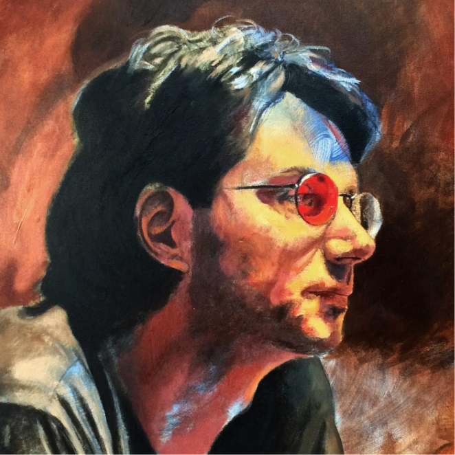
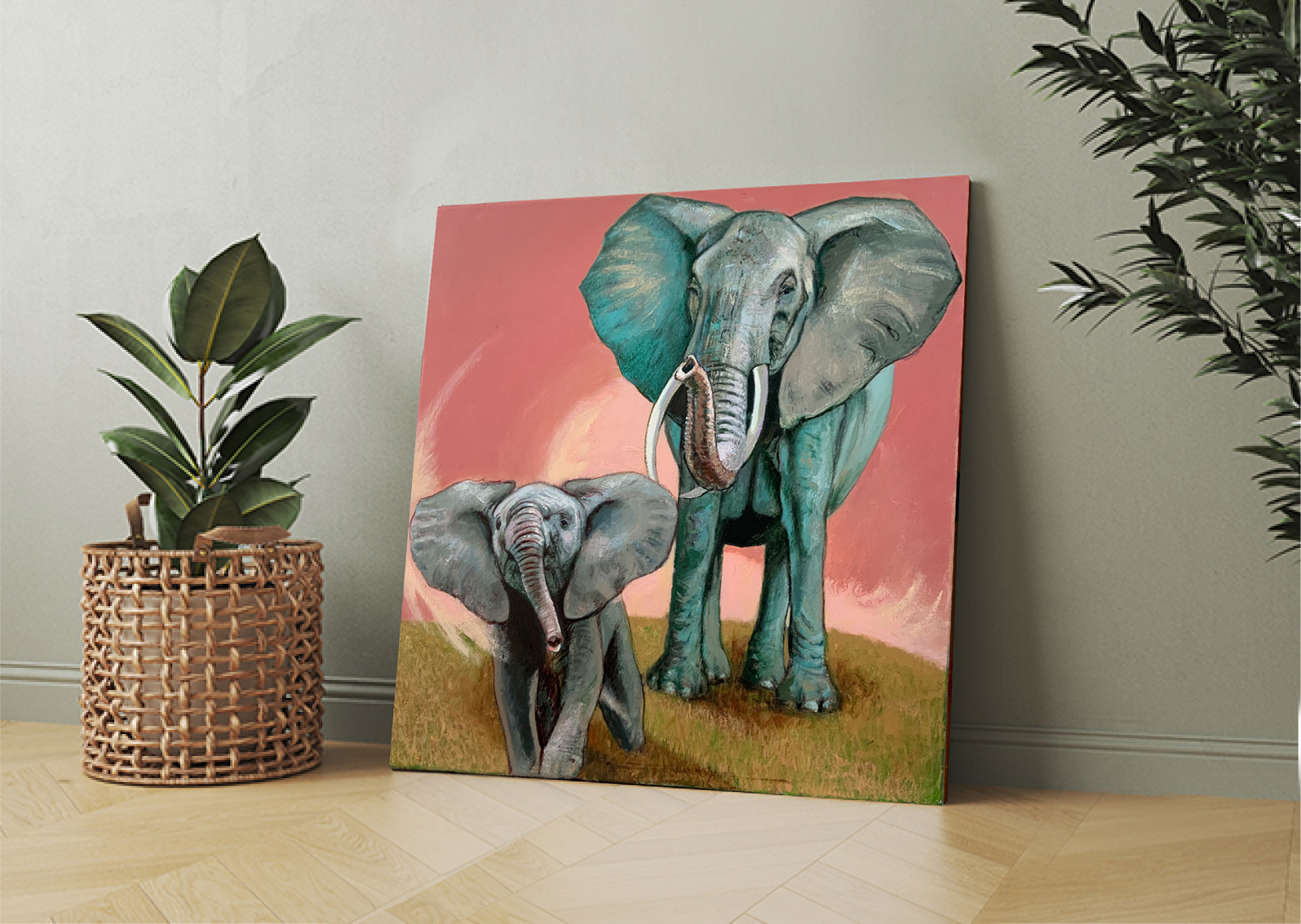
When it comes to integrating color psychology into interior design, artwork can play a pivotal role in setting the tone and atmosphere of a space. One artist whose work exemplifies the principles of color psychology is Fernando Davila. As a color-blind artist, Davila brings a unique perspective to his creations, mixing hues in unexpected ways to evoke emotion and intrigue.
Davila’s artwork often features a harmonious blend of colors that transcend traditional boundaries and offer viewers a captivating visual experience. His recent 2024 exhibition, titled “Davila Squared,” featured sculptures by himself and his son, Rod Davila. The event was held at the RFA Decor Gallery in Boca Raton, Florida. This father-son exhibition provided a unique opportunity to see the artistic lineage of the Davila family on display. Whether it’s a vibrant abstract composition or a serene landscape, each piece has the power to evoke a range of emotions and stimulate the senses.
For designers looking to incorporate Davila’s artwork into their projects, consider the following suggestions:
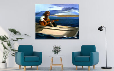
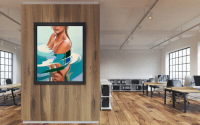
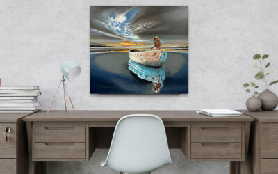
- Create a focal point: Select a striking piece of Davila’s artwork to serve as the focal point of a room. Whether it’s a bold statement piece over a fireplace or a series of smaller works displayed in a gallery style, his art can add depth and personality to any space.
- Set the mood: Choose artwork that matches the desired mood and atmosphere of the room. For a calming bedroom retreat, choose Davila’s serene landscapes or abstract compositions in soothing blues and greens. For a lively entertaining area, consider his vibrant pieces in bold reds or yellows to energize the space.
- Enhance existing color schemes: Use Davila’s artwork to complement and enhance existing color schemes within a space. His versatile pieces can be seamlessly integrated into a variety of design styles and color palettes, adding visual interest and depth to any space.
By incorporating Fernando Davila’s artwork into interior design projects, designers can harness the power of color psychology to create spaces that not only look beautiful, but also evoke specific emotions and behaviors in those who inhabit them. Whether it’s soothing blues, energizing reds or harmonious greens, Davila’s art offers endless possibilities for transforming interiors into immersive environments that inspire and delight.